Helping users modify cab bookings without starting over
At MakeMyTrip, I redesigned the post-booking cab modification flow to make modifying a cab booking simpler, clearer, and more transparent, resulting in fewer drop-offs and an increase in the conversion rate.
Lead designer
June-July 2024
Itika Satsangi
Parth Siddharth
Sakshi Chawla
Interaction Design,
Usability Testing,
Cross-functional Collaboration
The post-booking cab modification experience
MakeMyTrip is one of India’s leading online travel platforms, helping users plan holidays and book flights, hotels, buses, trains, and cabs. As a Product Design Intern, I worked on the post-booking cab modification flow, where users needed to change their pickup time or location after confirming a cab. The existing experience made users repeat parts of the booking journey, reselect cab options, and review changes without clearly understanding what had changed or why the final price had changed. The goal was to make the cab modification experience faster, clearer, and easier to complete.
Modifying a booking is meant to save time, but when it ends up being as long and more confusing than booking a new cab, it defeats the purpose
Say your flight gets delayed and you want to push your pickup time, or your plans change and you need to update the pickup location. Naturally, you’d want to quickly modify your existing booking and move on. But on MakeMyTrip, the current modification flow doesn’t quite meet that expectation.
Small changes, like adjusting the time or location, can trigger a chain of backend updates: pricing changes, different cab types, or even a new provider. The user ends up having to go through so much information, it feels like they’re booking a cab all over again.

VS

Modifying a booking follows the same steps as making a new one
Why it matters
Since modifying a booking feels as time-taking as starting over, many users end up cancelling and rebooking instead. This pattern shows up in our data through a high number of cancellations followed by new bookings, as well as significant drop-off rates in the modification flow.
Users drop off when trying to make simple changes to their booking
70% of users dropped off between the edit and review steps
*Data adjusted to comply with company policies
Many users canceled their cab bookings close to travel time, even if it meant paying a cancellation fee. A large chunk of them would then immediately rebook a new cab.
Most users modified their booking in order to change the pickup time or the pickup location
⏱️
📍
Conducting usability testing
"Why do I need to select a cab model again if I simply want to change the pickup time?"
"Weird, the price for the listed cabs is higher for some reason. And what 'extra payable' mean?"
"Not sure if the pickup time has been modified. Where do I see the new time before paying?"
"I need to pay to modify my booking even though there is no modification charge? I already paid a small amount to confirm my original booking."
There's a catch. Even simple edits trigger complex changes in a multi-vendor system
MakeMyTrip works as a cab aggregator, unlike competitors like Uber, BluSmart or Quickride which control their own supply, This makes even simple modifications more complex.
Changing a pickup time or location triggers a backend check across providers. In the best case, the same cab is still available and only the price adjusts. But if it isn't, the car type, fuel type, supplier, or trip policy may all change at once — sometimes all together.
On top of this, MMT lets users pay partially or fully at booking, so any fare change from a modification needs to be communicated clearly to avoid confusion at payment.
The goal despite all this: keep the user-facing experience fast, simple, and transparent.
Hypothesis : Users don’t want to re-evaluate their cab choice during modification
Since most modifications involve changes to pickup time or location, asking users to re-select a cab adds unnecessary complexity.
🕐
📍
🚗
Asking users to re-select a cab during modification ignores a decision they’ve already made—considering boot space, number of passengers, comfort, and selecting a cab accordingly. Since users spend time selecting a cab that fits their needs during booking, they are unlikely to want to re-evaluate all options during modification.
Thus, the modification flow should prioritize speed by offering the closest possible match to the original cab, while clearly highlighting any changes.
Restructuring the flow
Based on this, the flow was redesigned to reduce unnecessary steps and support quick modifications. The flow removes the need to re-select a cab during modification.
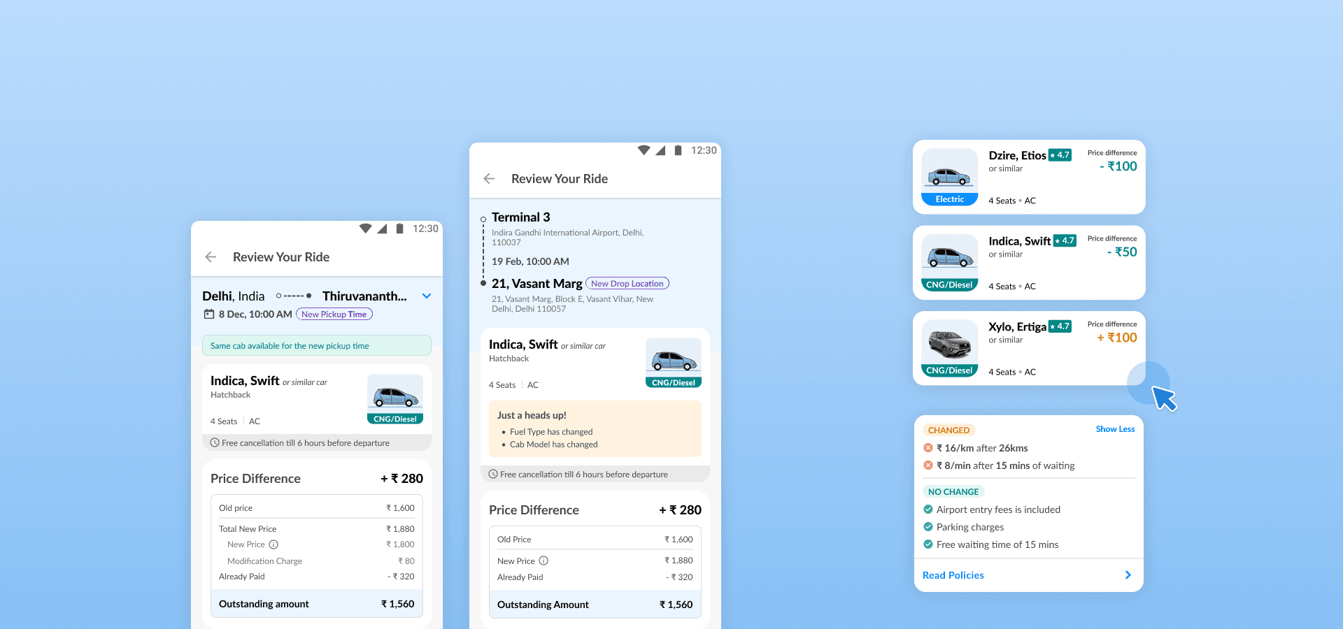
After users update their pickup details, the system shows the same cab or the closest possible match based on the original selection. Any changes—such as price, fuel type, or policies—are clearly highlighted before confirmation. Pricing is adjusted based on the user’s original payment method, ensuring transparency in the final amount payable.
Current flow
Redesigned flow
CURRENT
Re-enter booking details
Browse all cabs
Select a cab
Review
Pay if applicable and confirm
REDESIGNED
Edit what needs to change
Closest cab match shown
Browse alternatives only if needed
Review
Pay if applicable and confirm
Users need clear, upfront breakdowns to understand price changes

Users just want to see which policies have changed, not compare everything

Make only the changes you need

The review page at a glance

Changes in cab details are clearly called out

Policies card highlights what changed, making it easy to scan without overwhelming users

Clear and upfront price breakdown

Browse other cab options if the suggested match doesn’t fit your needs

The redesigned flow made cab modifications faster, clearer, and less repetitive
By removing unnecessary setps, more users completed modifications instead of abandoning the process
More users completed pickup time or location changes within the same booking instead of cancelling and booking again
Users could see price, policy, and cab detail changes before confirming the modification, reducing drop-offs at the review page
⚖️
I learned that transparency does not mean showing every detail with equal weight. The challenge was to make price, policy, and cab detail changes visible upfront, while structuring the information so users could scan it without feeling overwhelmed.
🤝
Working with product and data teams helped me connect user pain points with actual booking behavior, supply constraints, and business goals. This made the redesign more grounded than relying only on interface-level observations.
🎯
I learned to use data to separate the main user intent from edge cases. Since most users were modifying pickup time or location, the core flow could stay quick, while more complex actions like changing the cab model remained available as a secondary path.